Ripple 水波纹效果

声明

代码借鉴了 keen-ui 和 material-ui 的实现方式

前言

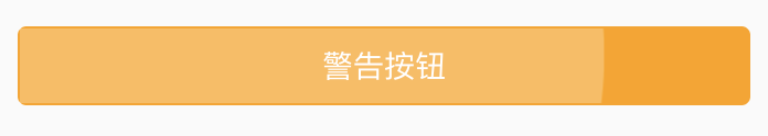
在日常项目中,经常会看到点击button或某个元素块时,有水波纹效果,如下图所示:

ripple button

下面,我们将分析如何实现这个效果

设计

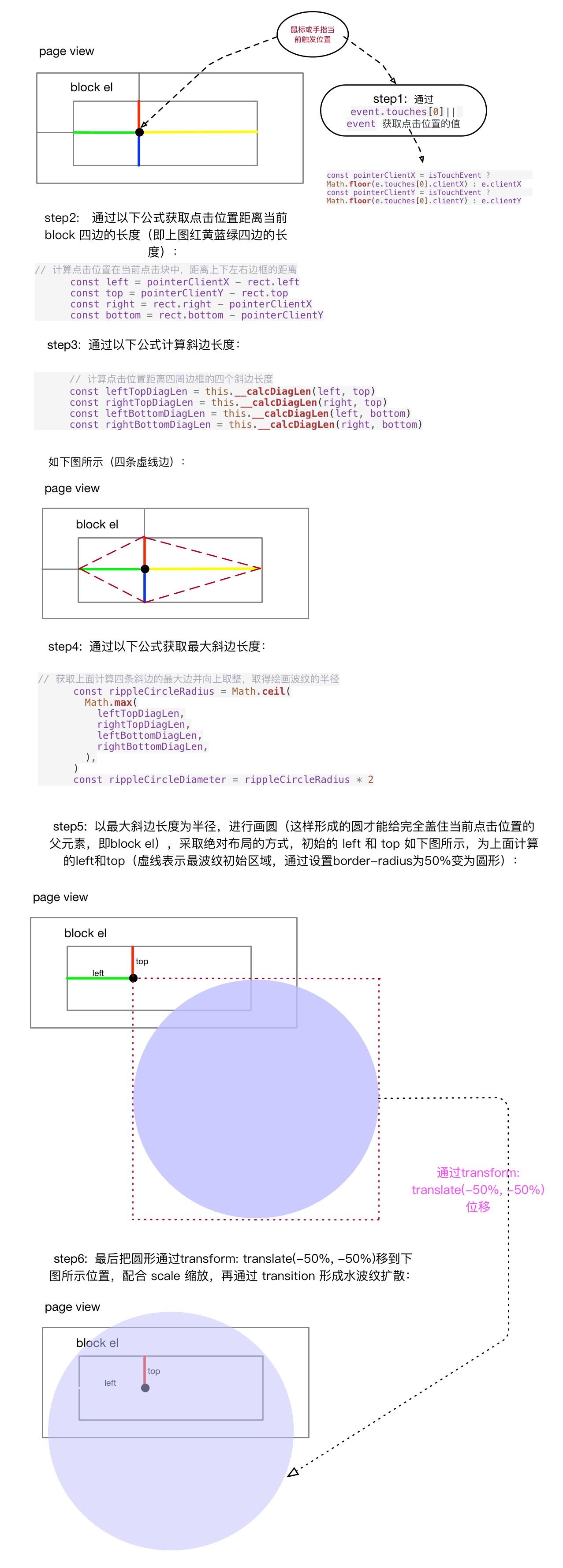
常见的波纹点击效果的实现方式是监听元素的 mousedown、 mouseup 事件(pc端), touchstart touchend 事件(mobile端),因为mouse事件和touch事件时优先于click事件的,并且有多个回调状态。

通过监听上述事件,在元素内部创建一个波纹元素,并调整元素的 transformopacity 属性,通过计算点击的位置来设置波纹元素的大小和位置,已达到波纹扩散的效果。

我们讲组件分为2个部分,circleRipple 子组件 和 ripple 父组件:

  • circleRipple 为波纹扩散组件,由 transition 组件包裹来设置动画,实现波纹扩散效果
  • ripple 父组件,监听 mousetouch 相关事件来控制 circleRipple 的位置和显示

实现

CircleRipple

利用 vue 的 transition 组件的来完成 circleRipple 的动画效果,之所以设置为子组件,就是为了方便从外部通过传参来控制它的样式。实现代码如下:

1
2
3
4
5
6
7
8
9
10
11
12
13
14
15
16
17
18
19
20
<template>
<transition name="ripple">
<div :class="b()" :style="styles"/>
</transition>
</template>

<script>

export default {
name: 'ripple-circle',
props: {
styles: {
type: Object,
default () {
return {}
},
},
},
}
</script>

样式代码如下所示:

1
2
3
4
5
6
7
8
9
10
11
12
13
14
15
16
17
18
19
.ripple-circle
position: absolute
border-radius: 50%
opacity: .1
background-color: currentColor
background-clip: padding-box
pointer-events: none
user-select: none

.ripple-enter-active,
.ripple-leave-active
transform: translate(-50%, -50%) scale(1)
transition: opacity 1s ease-out, transform 0.25s ease-out

.ripple-enter
transform: translate(-50%, -50%) scale(0)

.ripple-leave-to
opacity: 0 !important

上述代码中有2个需要注意的属性:

  1. 设置 background-color: currentColor, 使用该关键字的元素的(或其最近父元素)color属性的颜色值
  2. 设置 background-clip: padding-box, 使背景被裁剪到内边距框,不包含border

Ripple

Ripple 需要控制 circleRipple 的显示,如果频繁点击可能出现多个 circleRipple

1
2
3
4
5
6
7
8
9
10
11
12
13
14
15
16
17
18
19
20
21
22
23
24
25
26
27
28
29
30
31
32
33
34
35
36
37
38
39
40
41
42
43
44
45
46
47
48
49
50
51
52
53
54
55
56
57
58
59
60
61
62
63
64
65
66
67
68
69
70
71
72
73
74
75
76
77
78
79
80
81
82
83
84
85
86
87
88
89
90
91
92
93
94
95
96
97
98
99
100
101
102
103
104
105
106
107
108
109
110
<template>
<div
:class="b()"
@contextmenu.prevent
@touchstart="start"
@touchend="end"
@touchcancel="end"
@mousedown="start"
@mouseup="end"
@mouseleave="end"
>
<!--多个波纹用 v-for 控制-->
<ripple-circle v-for="ripple in ripples" :key="ripple.key" :styles="ripple.style"/>
</div>
</template>

<script>
import RippleCircle from './ripple-circle'

const hasTouchEvent = 'ontouchstart' in document.documentElement
let rippleKey = 0

export default {
name: 'ripple',
components: {
RippleCircle,
},
props: {
rippleOpacity: {
type: [Number, String],
default: '0.15',
},
rippleColor: {
type: String,
default: '',
},
},
data () {
return {
ripples: [],
}
},
methods: {
start (e) {
if (hasTouchEvent && !e.touches) return
const ripple = {
key: rippleKey++,
style: this.__calcRippleStyle(e),
}

// 增加一个波纹元素只需要在 ripples 数组中push一个 ripple 对象即可
this.ripples.push(ripple)
},

end (e) {
if ((hasTouchEvent && !e.touches) || this.ripples.length === 0) return
// 删除数组中第一个一个波纹元素
this.ripples.splice(0, 1)
},

// 计算波纹样式并返回
__calcRippleStyle (e) {
const { target } = e
const rect = target.getBoundingClientRect()
const isTouchEvent = e.touches && e.touches.length

const pointerClientX = isTouchEvent ? Math.floor(e.touches[0].clientX) : e.clientX
const pointerClientY = isTouchEvent ? Math.floor(e.touches[0].clientY) : e.clientY

// 计算点击位置在当前点击块中,距离上下左右边框的距离
const left = pointerClientX - rect.left
const top = pointerClientY - rect.top
const right = rect.right - pointerClientX
const bottom = rect.bottom - pointerClientY

// 计算点击位置距离四周边框的四个斜边长度
const leftTopDiagLen = this.__calcDiagLen(left, top)
const rightTopDiagLen = this.__calcDiagLen(right, top)
const leftBottomDiagLen = this.__calcDiagLen(left, bottom)
const rightBottomDiagLen = this.__calcDiagLen(right, bottom)

// 获取上面计算四条斜边的最大边并向上取整,取得绘画波纹的半径
const rippleCircleRadius = Math.ceil(
Math.max(
leftTopDiagLen,
rightTopDiagLen,
leftBottomDiagLen,
rightBottomDiagLen,
),
)
const rippleCircleDiameter = rippleCircleRadius * 2

// 确定波纹绘制的颜色、透明度、大小、位置
return {
color: this.rippleColor,
opacity: this.rippleOpacity,
width: `${rippleCircleDiameter}px`,
height: `${rippleCircleDiameter}px`,
left: `${left}px`,
top: `${top}px`,
}
},

// 计算斜边长
__calcDiagLen (a, b) {
return Math.sqrt(a * a + b * b)
},
},
}
</script>

注意:@contextmenu.prevent 表示鼠标右击时阻止浏览器打开默认的菜单选项

针对上述代码的分析见下图所示:

ripple-circle

👇下面有一个在线的可操作水波纹示例(大家可以点击亵玩):👇
https://codepen.io/shellWolf/pen/vPyQJX?editors=1100

样式代码如下所示:

1
2
3
4
5
6
7
.ripple
position: absolute
overflow: hidden
top: 0
left: 0
width: 100%
height: 101%

该组件通常与 buttoncell 等组件结合使用。

使用注意事项:由于 Ripple 组件内部都是 position:absolute 布局,使用时,需要在外部加上 position:relative
请点击查看 DEMO 效果(滚动到水波纹点击效果那一栏)

附录 ✨