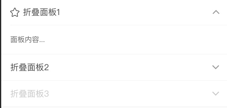
Collapse 折叠面板组件

前言

折叠面板组件直观展示:

collapse

下面我们一起分析如何实现这个组件

分析

  • 可以把组件拆分成父容器(collapse)和子组件(collapse-item)2个,然后在父组件上使用 v-model 进行双向绑定
  • 子组件折叠有2种方式,第一种是普通展开模式,第二种是accordion(手风琴)模式
  • 对折叠项内容展开和收起时运用动画,产生平滑过渡效果

实现

Collapse 父组件

模板代码如下:

1
2
3
4
5
6
7
8
9
10
11
12
13
14
15
16
17
18
19
20
21
22
23
24
25
26
27
28
29
30
31
32
33
34
35
36
37
38
39
40
41
42
43
44
45
46
47
48
49
50
51
52
53
54
<template>
<group :class="b()">
<slot />
</group>
</template>

<script>

import Group from './group'

export {
name: 'collapse',

components: {
Group,
},

props: {
// 控制手风琴效果
accordion: Boolean,
// 用于生成双向绑定
value: [String, Number, Array],
},

provide () {
return {
Collapse: this,
}
},

data () {
return {
items: [],
}
},

methods: {
switch (name, expanded) {
if (!this.accordion) {
name = expanded
? this.value.concat(name)
: this.value.filter(activeName => activeName !== name)
} else {
name = expanded
? name === this.value ? '' : name
: ''
}

this.$emit('input', name)
this.$emit('change', name)
},
},
}
</script>

上述代码有几点需要注意的地方:

  1. provide / inject 允许一个祖先组件向其所有子孙后代注入一个依赖,不论组件层次有多深,并在起上下游关系成立的时间里始终生效
  2. 通过属性 valueswitch 方法中发射 input 事件,让自定义组件实现双向绑定
  3. accordion 属性为真时,展开的折叠项只有一个,记录到一个字符串中即可,当为假时,可以有多个折叠项同时是展开状态,这个时候我们需要用数组记录状态

Collapse Item 子组件

模板代码如下:

raf, cancel 源码见 →附录←

1
2
3
4
5
6
7
8
9
10
11
12
13
14
15
16
17
18
19
20
21
22
23
24
25
26
27
28
29
30
31
32
33
34
35
36
37
38
39
40
41
42
43
44
45
46
47
48
49
50
51
52
53
54
55
56
57
58
59
60
61
62
63
64
65
66
67
68
69
70
71
72
73
74
75
76
77
78
79
80
81
82
83
84
85
86
87
88
89
90
91
92
93
94
95
96
97
98
99
100
101
102
103
104
105
106
107
108
109
110
111
112
113
114
115
116
117
118
119
120
121
122
123
124
125
126
127
128
129
130
131
132
133
134
135
136
137
138
139
140
141
142
143
144
145
146
147
148
149
150
151
<template>
<div
:class="[
b(),
{ 'thinline--top': index }
]"
>
<!-- 通过 $props 将父组件的 props 一起传给子组件 - -->
<cell :class="b('title', { expanded, disabled })" v-bind="$props" @click="onClick">
<slot slot="icon" name="icon" />
<slot slot="title" name="title" />
<slot slot="value" name="value" />
<slot slot="right-icon" name="right-icon" />
</cell>

<div
v-if="inited"
v-show="show"
ref="wrapper"
:class="b('wrapper')"
@transitionend="onTransitionEnd"
>
<div ref="content" :class="b('content')">
<slot />
</div>
</div>
</div>
</template>

<script>
import { raf, cancel } from '../utils/raf'

let rafID = null

export default create({
name: 'collapse-item',

props: {
name: [String, Number],
disabled: Boolean,
icon: String,
description: String,
title: [String, Number],
value: [String, Number],
border: {
type: Boolean,
default: true,
},
isLink: {
type: Boolean,
default: true,
},
},

inject: ['Collapse'],

data () {
return {
show: null,
inited: null,
}
},

computed: {
items () {
return this.parent.items
},

index () {
return this.items.indexOf(this)
},

currentName () {
return this.isDef(this.name) ? this.name : this.index
},

expanded () {
if (!this.parent) {
return null
}

const { value } = this.parent

return this.parent.accordion
? value === this.currentName
: value.some(name => name === this.currentName)
},
},

watch: {
expanded (expanded, prev) {
if (prev === null) {
return
}

if (expanded) {
this.show = true
this.inited = true
}

this.$nextTick(() => {
const { content, wrapper } = this.$refs
if (!content || !wrapper) {
return
}

const contentHeight = content.clientHeight + 'px'

// 处理第一次高度展开或收起来时的动画
wrapper.style.height = expanded ? 0 : contentHeight
rafID = raf(() => {
wrapper.style.height = expanded ? contentHeight : 0
})
})
},
},

created () {
if (!this.Collapse) {
console.error('CollapseItem needs to be child of Collapse')
} else {
this.parent = this.Collapse
}

this.items.push(this)
this.show = this.expanded
this.inited = this.expanded
},

destroyed () {
cancel(rafID)
this.items.splice(this.index, 1)
},

methods: {
onClick () {
if (this.disabled) {
return
}

this.parent.switch(this.currentName, !this.expanded)
},

onTransitionEnd () {
if (!this.expanded) {
this.show = false
}
},
},
})
</script>

分析代码:

  1. 通过 inject 接收父组件的依赖,并在 created 生命周期中进行校验和初始化
  2. 子组件内容容器上同时运用 v-ifv-show 这样保证了,第一次时不做全部渲染,又保证了后续切换时,不需要进行频繁的重新生成dom
  3. 如果不显示设置 name, 默认值为当前组件在折叠列表中的索引值
  4. 通过 currentName 与 父组件的 value 值进行比较判断确定当前子项的展开状态
  5. 它点击改变子项的状态时,监听展开状态,并在里面对展开内容,进行第一帧的raf动画,其他帧是css动画
  6. 通过 onTransitionEnd 捕捉过渡结束状态,并同时改变 show 变量的状态

样式代码如下:

1
2
3
4
5
6
7
8
9
10
11
12
13
14
15
16
17
18
19
20
21
22
23
24
25
26
27
28
29
30
31
32
33
34
35
36
37
38
39
40
41
42
43
44
45

.collapse-item {
&__title {
.cell__right-icon::before {
transition: .3s
transform: rotate(90deg)
}

&::after {
visibility: hidden
}

&--expanded {
.cell__right-icon::before {
transform: rotate(-90deg)
}

&::after {
visibility: visible
}
}

&--disabled {
&,
& .cell__right-icon {
color: $gray
}

&:active {
background-color: #fff
}
}
}

&__wrapper {
overflow: hidden
will-change: height
transition: height .3s ease-in-out
}

&__content {
padding: 15px
background-color: #fff
}
}

从上述代码可知,针对 height 做过渡,实现平滑折叠效果

DEMO展示

点击下方链接查看 👇:
http://wechat.hand-china.com/hippius-ui/#/zh-CN/collapse

附录:

  • raf 源码分析见 raf