Button 按钮组件

前言

在日常开发中,button组件是使用频率比较高的组件,原生的HTML button标签只能满足一部分的使用场景,所以需要对button标签进行二次封装,来满足更多的场景。

设计

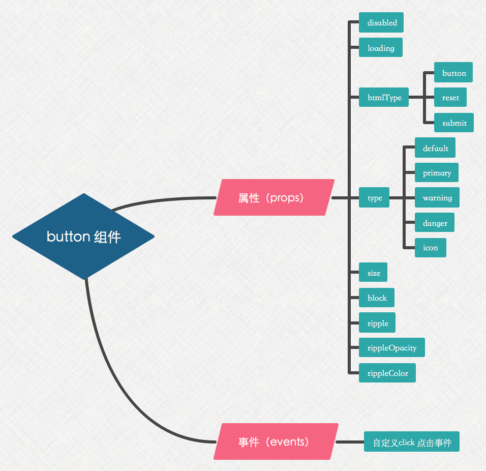
对于一个button组件,我们对它做如下设计:

  1. 保留原生HTML button标签的部分特性 (如:type, disabled等)
  2. 通过传入type prop,来展示不同类型的button
  3. 通过传入loading prop,来控制button的加载效果
  4. 通过传入icon prop,实现button和icon的结合
  5. 通过传入ripple prop,实现水波纹的点击效果
  6. 通过传入block prop,来控制button的宽度是否继承父容器宽度
  7. 提供自定义的click事件,来响应用户的点击

具体设计如下所示:

button

实现

组件代码如下所示:

1
2
3
4
5
6
7
8
9
10
11
12
13
14
15
16
17
18
19
20
21
22
23
24
25
26
27
28
29
30
31
32
33
34
35
36
37
38
39
40
41
42
43
44
45
46
47
48
49
50
51
52
53
54
55
56
57
58
59
60
61
62
63
64
65
66
67
68
69
70
71
72
73
<template>
<button
:class="[
b([type, size, {
loading,
icon,
block,
ripple
}])]"
:disabled="disabled"
:type="htmlType"
@click="handleClick"
>
<spin v-if="loading" size="16px"/>

<ripple v-if="ripple && !loading && !disabled" :ripple-opacity="rippleOpacity" :ripple-color="rippleColor"/>

<slot name="icon">
<icon v-if="icon" :name="icon" />
</slot>

<slot/>
</button>
</template>

<script>
import Spin from '../spin'
import Ripple from '../ripple'

export default {
name: 'button',
components: {
Ripple,
Spin
},
props: {
disabled: Boolean,
// 设置 button 原生的 type 值
htmlType: {
type: String,
default: 'button',
},
// 设置按钮类型
type: {
type: String,
default: 'default',
},
icon: String,
loading: Boolean,
// 支持large、default、small三种尺寸,默认为default, 当为默认时不需要设置
size: {
type: String,
default: '',
},
// 开启水波纹点击
ripple: Boolean,
// 设置波纹透明度
rippleOpacity: [String, Number],
// 设置波纹颜色,默认取字体颜色 (currentColor)
rippleColor: String,
// 将按钮宽度调整为其父宽度的选项
block: Boolean,
},
methods: {
handleClick (event) {
// loading 和 disabled 状态下不做click 事件处理
if (!this.loading && !this.disabled) {
this.$emit('click', event)
}
},
},
}
</script>

提示:不同的浏览器对 <button> 元素的 type 属性使用不同的默认值, 所以我们需要给自定义的button 组件的 htmlType 属性设置默认的值为 button

从上可知button组件提供了2个 slot

  1. 默认插槽一般用于接收button组件的文本传入;
  2. icon 插槽,提供给用户插入图片的途径(当icon图标不能够完全满足需求时,我们可以传入图片代替)

由于它没有复杂的逻辑,基本上就是一个视图组件,接下来我们将重点分析它的样式,对应的css样式(stylus语法)代码 如下所示:

1
2
3
4
5
6
7
8
9
10
11
12
13
14
15
16
17
18
19
20
21
22
23
24
25
26
27
28
29
30
31
32
33
34
35
36
37
38
39
40
41
42
43
44
45
46
47
48
49
50
51
52
53
54
55
56
57
58
59
$text-color = #4a4a4a
$border-color = #eee
$gray-darker = #666
$gray-dark = #999

.button
position: relative
display: inline-block
box-sizing: border-box
color: $text-color
background: $white
height: 34px
line-height: 32px
padding: 0 12px
border-radius: 4px
border: 1px solid $border-color
box-shadow: none
text-align: center
font-size: 14px
cursor: pointer
outline: none
touch-action: manipulation
white-space: nowrap
user-select: none
-webkit-appearance: none
-webkit-text-size-adjust: 100%

&::before
content: ""
position: absolute
z-index: 1
top: -1px
left: -1px
bottom: -1px
right: -1px
width: 100%
height: 100%
opacity: 0
border: inherit
border-radius: inherit
background-color: $gray-darker
pointer-events: none
transition: opacity .3s

&:active::before
opacity: 0.15

&[disabled]
&,
&:focus,
&:active
cursor: not-allowed
background-color: $border-color
color: $gray-dark
border: 1px solid $border-color
box-shadow: none
&::before,
&:active::before
display: none

分析上述重点样式代码:

  1. 设置 -webkit-appearance: none 去除 button 标签默认的appearance样式,常用于IOS下移除原生样式
  2. 设置 outline: none去除外边线样式
  3. 设置 touch-action: manipulation 可减少浏览器在用户点击时延迟生成点击事件的情况
  4. 设置 white-space: nowrap 禁止组件文本换行
  5. 设置 user-select: none 阻止button组件文本被选择(复制)
  6. 设置 -webkit-text-size-adjust: 100% 关闭字体大小自动调整功能

还需要注意的是,当点击button组件时,需要设置active状态下的样式,如果直接在button上改变 background-color 或者其它样式的值,这样将会导致额外的 layout 和 paint, 如下所示:
background-color trigger

为了能够进行性能优化,做如下设计:

  1. 将 button 组件 active 状态下的样式通过在 ‘::before’ 上设置绝对定位进行触发,这样点击button时就不会影响到其他dom的渲染
  2. 为了不影响button的正常点击操作,需要在伪元素上设置 pointer-events: none 这样点击事件就会穿透到真正到button元素上
  3. 通过改变 opacity 样式来反馈 active 状态
  4. 为了做更近一步的优化,我们通过设置 transition 样式将伪元素提升为合成层 (元素提升为合成层后,transform 和 opacity 才不会触发 paint,如果不是合成层,则其依然会触发 paint

提示:(这里是引用 justjavac 大神的回答)
在 Blink 和 WebKit 内核的浏览器中,对于应用了 transition 或者 animation的 opacity 元素,浏览器会将渲染层提升为合成层。也可以使用 translateZ(0) 或者 translate3d(0,0,0) 来人为地强制性地创建一个合成层。

可以通过使用 Chrome DevTools 工具来查看页面中合成层的情况,在 Rendering 标签下,勾选上 Show layer borders即可

请点击查看 DEMO 效果

附录 ✨